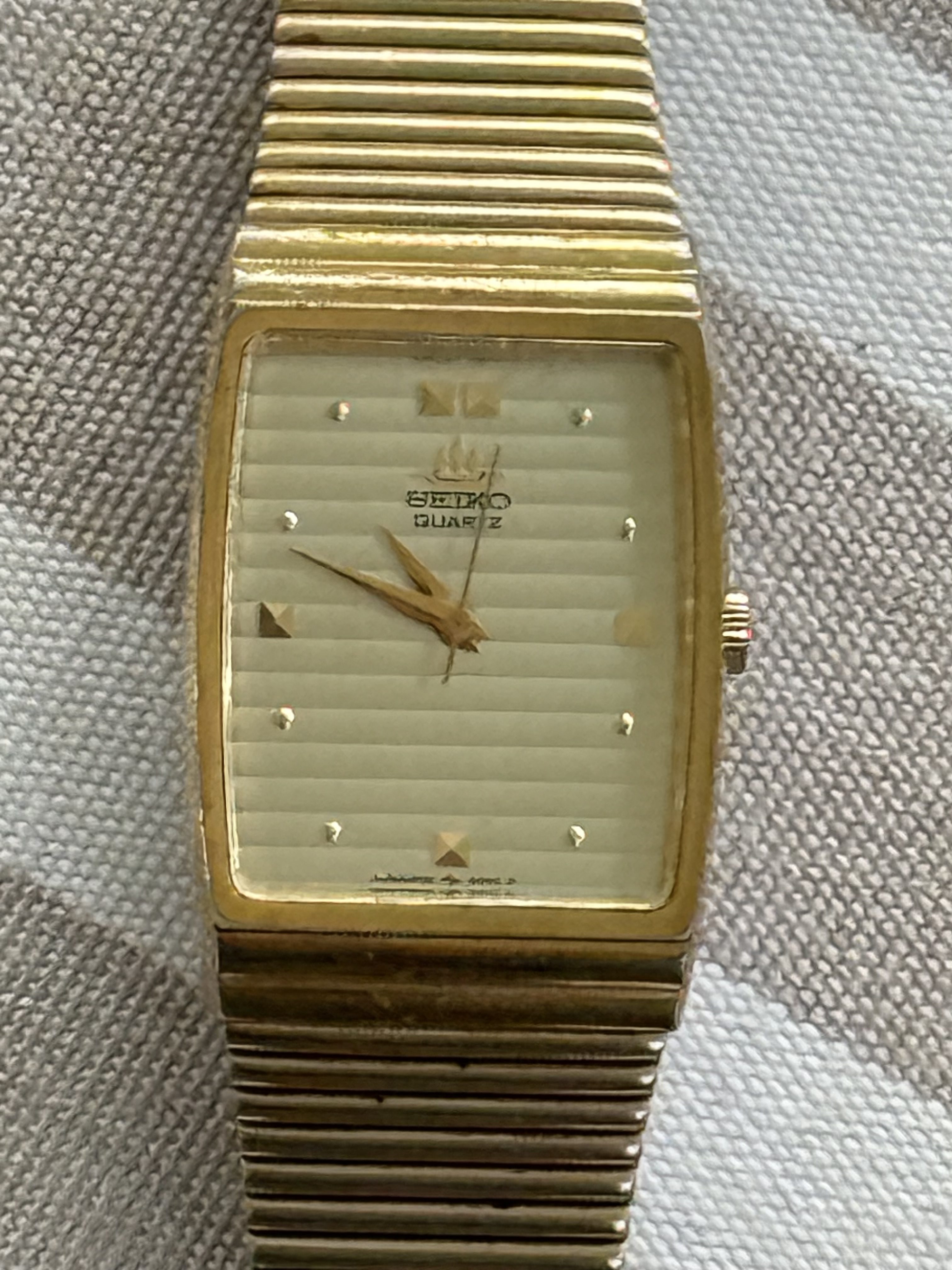
At about 24.8 mm across, this vintage Seiko lands in a very useful middle space. In my view, it wears as a true in-between watch. It can read a little dressy, a little architectural, and still stay relaxed on the wrist.

I would call the case shape close to tank, but not fully tank. For my part, tonneau or barrel feels more accurate because there is some softness and curve to it. That curve keeps the watch interesting and from looking stiff, and it gives the piece a little more style than a plain rectangular case would have had.

I find the dial super cool. The horizontal texture gives it more unusual vibes than a flat dial would have had. The pyramid markers at the quarters are so unique, the smaller round markers fill the space nicely, and the hands have just enough sharpness to fit the rest of the design. In my view, Seiko did a lot here without making the watch busy. It still reads quickly, but there is plenty to look at.

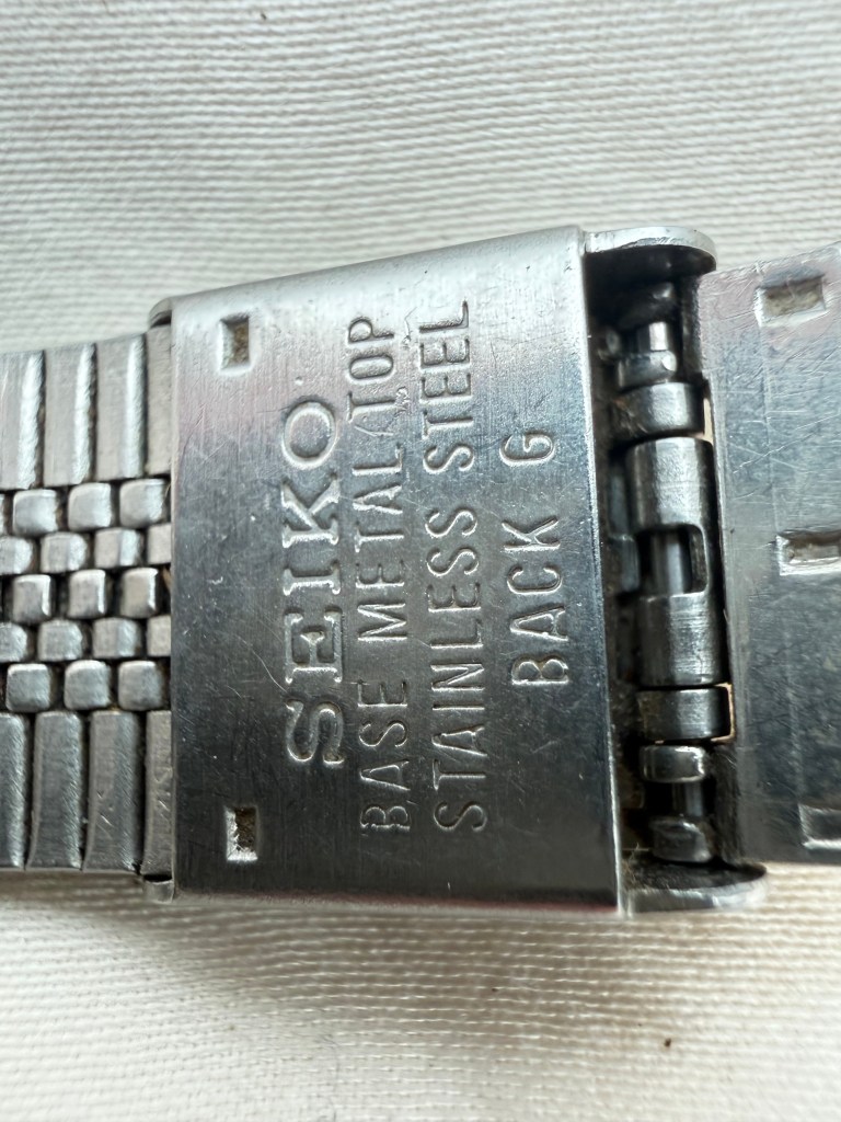
I also really like the texture on the outside of the case and bracelet. Those super-thin lines are the first thing that gives the watch its own identity. I think that detail does a lot of work. The watch feels integrated in a real way because the case and bracelet share the same language. It looks like one design instead of a watch head with a bracelet attached afterward. Then inside the bracelet you get stainless steel throughout, which I find reassuring. It gives the watch some durability and makes the construction feel honest.

I would also say the weight is nicely judged. It has a medium weight that feels substantial enough without becoming heavy. Some slim vintage quartz pieces feel almost too light, almost disposable. This one does not. It has enough presence to feel like a real object on the wrist, but it is still thin enough to slip easily under a cuff.

I think the bracelet size is actually one of the more unusual things here. It is not common to find an integrated bracelet watch like this that can fit over an eight-inch wrist. To me, that suggests it was probably originally sold more toward men, even if today it makes complete sense as a unisex watch. For my part, that only adds to the appeal. It can move around. It can be worn out at night, worn dressed up, or even worn casually as the thing that gives an outfit some shape.

I also think gold-tone vintage watches are having a bit of a return. When the design is good, the color brings warmth without needing to shout. This one is a good example. I find it more distinctive than a lot of vintage quartz watches because the shape, dial texture, and bracelet all have something to say. It is also still a working Seiko quartz watch. In my view, that makes it a very sensible vintage buy. You get the style and period feel without taking on the extra trouble that can come with a more complicated watch.

This example definitely shows wear, and that is part of the deal with a watch like this. The aging on the case, bracelet, and crystal is visible. For my part, I don’t mind the wear. The design still comes through clearly. The dial still looks cool, the case still has presence, and the bracelet still carries the watch.
I find this one easy to recommend for someone who wants a vintage Seiko that is a little different. It is slim, versatile, comfortable, and more unusual than most gold-tone quartz pieces at this level. It has a good shape, good texture, and a size that still makes sense now. Available for purchase here.

Leave a Reply